Songbird Pop Up Shop at West Elm Seattle
I am SO SO SO excited to finally share that we'll be holding a pop-up shop at West Elm in Seattle on Saturday, November 5th!
This will be our FIRST pop-up shop and it will be such a fun way for people to see some of the goodies we make, aside from all the lovely wedding ephemera.
The timing couldn't be more perfect with the holidays around the corner! Stop by to pick up some Thanksgiving decor to jazz up your table setting or get a jump start on those Christmas cards and holiday shopping.
THE DETAILS
Date: Saturday, November 5th
Time: 12 -3 p.m.
Location: West Elm Seattle - South Lake Union
2201 Westlake Ave.
Seattle, WA 98121
RSVP: Visit our Facebook page to stay up-to-date as we reveal some of the new items we're creating exclusively for this event!
We'll have the following items (and more!) available for sale:
- Thanksgiving and Christmas-themed Place Cards and Banners
- Prints
- Stationery
- Gift Tags
- Christmas Cards
- Greeting Cards
- Customizable Calligraphy and Paper Products
Hope to see you there!
xoxo,
Rosie
10 Fun Ideas for Unique Wedding Invitations
Wedding invitations - the meat and bread of Songbird Paperie! Wedding stationery is the first glimpse of your special day, so make it count! Here are 10 fun ideas to make your invites unique and get guests pumped for the best day ever!
Airplane Boarding Pass
Having a destination wedding? Play off of the travel theme and get your guests excited for the trip! Go retro and include your "boarding pass" invitation, info card-turned-travel-itinerary and RSVP "receipt" in a sleeve that has your wedding logo as the "airline" logo! Fun, right?
Concert Ticket
This one is near and dear to my heart - a couple of years ago, I was introduced to a lovely gal named Beth who wanted a creative custom-designed wedding invitation that would reflect her and her fiance's passion for concerts. I created this concert-ticket-inspired wedding invitation for them. Beth and her now-husband Isaac became good friends, and this fall they're celebrating their second wedding anniversary!
Camp Bride & Groom
The camp theme is not new, but I like to get inspiration from in-style ideas like these and take it the extra mile. Everyone loves a tree or a snowy mountain, but how about inviting your guests to an actual summer camp? Check out these invitations and matching welcome guides for your campers -- it's like they're going to a real summer camp!
Minimal Copy
Maximize the white space and take a modern approach to your invites. This clean, minimal layout will bring a refined look to your wedding stationery and leave your guests looking forward to a very classy affair.
Online RSVP? Tuck in a Business Card!
This one might be my favorite! What do you do when you have an online RSVP and don't necessarily need the card-and-envelope combo, but still want to highlight how guests should reply without cluttering your invitation much like this sentence is cluttered? (Haha!) Stick in a little business card-sized RSVP card with your wedding website.
Vintage Map Liners – Without Ruining Your Map!
Who doesn't love a good envelope liner? This can work for a destination wedding, wedding in your hometown or highlight where you're honeymooning. Find a vintage black and white map, scan it and print it on a creamy paper -- map stays intact and you've created a very unique envelope liner!
Separate Yes/No RSVP Cards
It's like choose your own adventure, RSVP-style! Instead of checking a box, guests choose which card to send in.
Big Art, Teeny Text
Another take on the modern and minimal invitation design -- let the art speak loudly and keep the text simple. Big, bold, and punchy!
Printable Vellum
Break free from traditional paper and use printable vellum for a strong, yet delicate touch. A monochromatic color scheme with darker colors look best on this semi-translucent paper.
Printable Linen
Another creative medium for your invites! Printable LINEN! You could take this a super elegant direction, with swoopy-swirly calligraphy, or a more relaxed vibe with handwritten-style font!
See something you like and would like to recreate it with us? Mosey on over to our contact page or send an email to erica@songbirdpaperie.com and we'll set up a coffee date to chat wedding invitation design!
xoxo,
Rosie
New Songbirdie: Erica Thesenvitz
I'm so excited to announce that my dear friend Erica has officially joined the Songbird Family! Fellow new mom to the adorable Baby Jack will help me run the business side so I can focus on the fun, creative part and take on more fabulous clients!
Erica and I went to only the best school ever together, USC (Fight On!), but didn't meet until post-graduation while we were both doing the dreaded long distance thing with our college sweethearts and now-hubbies, who rowed together on the Trojan Crew team. She is a very successful PR and Communications Pro and will be using her stellar business skills to help make Songbird even more awesome and make sure everyone we work with has a great experience!
As a way of introduction, I thought it would be fun to share photos from her special wedding day almost 2 years ago! I worked super closely with her to design everything for her wedding from the save the dates and invitation suite to custom guestbook and signs!
Enjoy!
xoxo,
Rosie
We collaborated on fun special touches for her save the dates and invites like custom stickers, map and sparkly envelope liners!
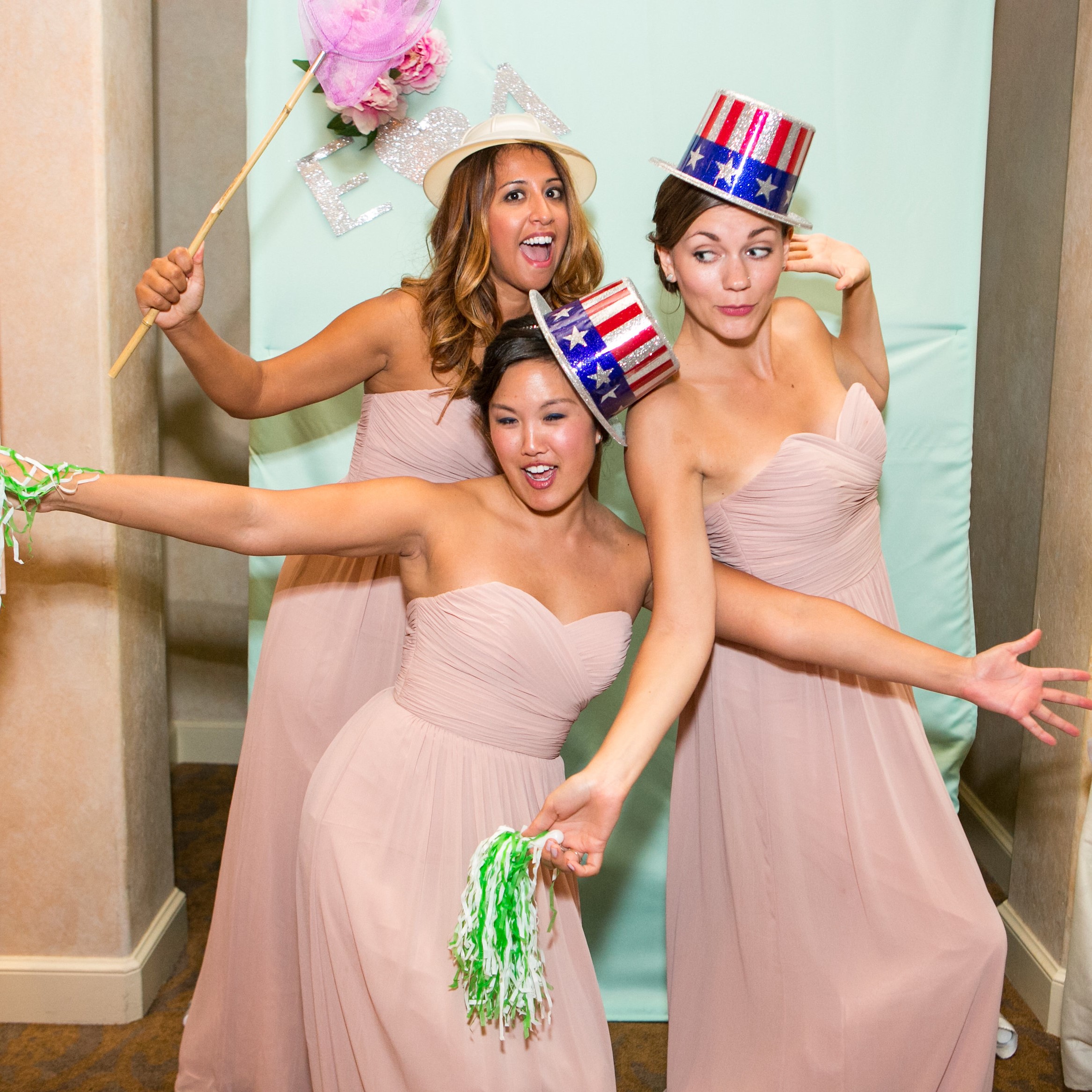
Such a cute set up that her maid of honor put together! Champagne is a key part of the day-of morning pampering! Erica and I got these beautiful sparkly boxes from Paper Source for her bridesmaid gifts and I custom made the gift tags.
How gorgeous are these robes from Plum Pretty Sugar?! LOVE!
Custom programs and welcome sign made by yours truly :)
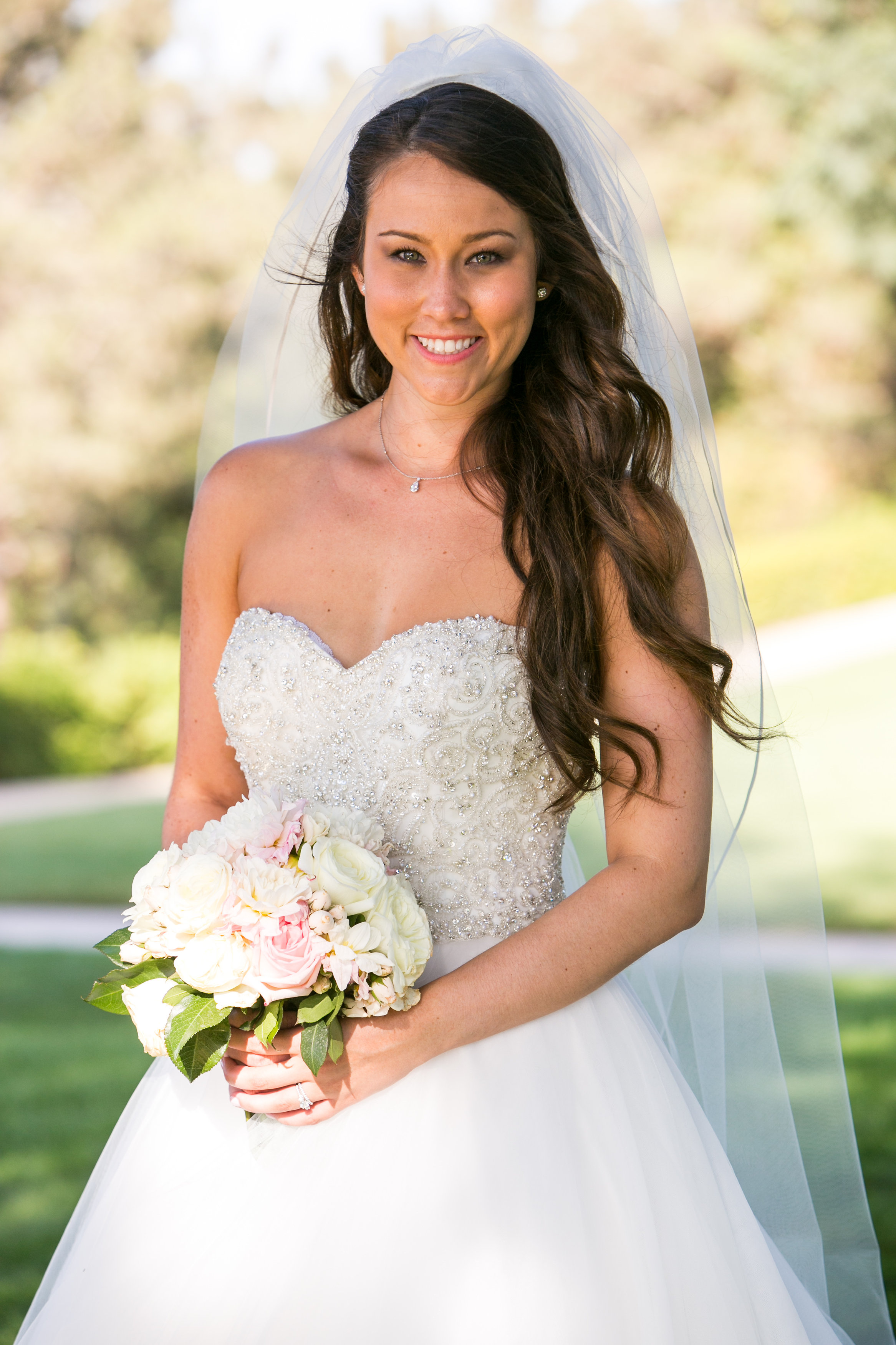
The lovely bride and groom!
Super fun cocktail hour menus for the bar!
Loved how the custom, hand lettered wood sign turned out! And as you can see, Mr. Architect was having a lot of fun!
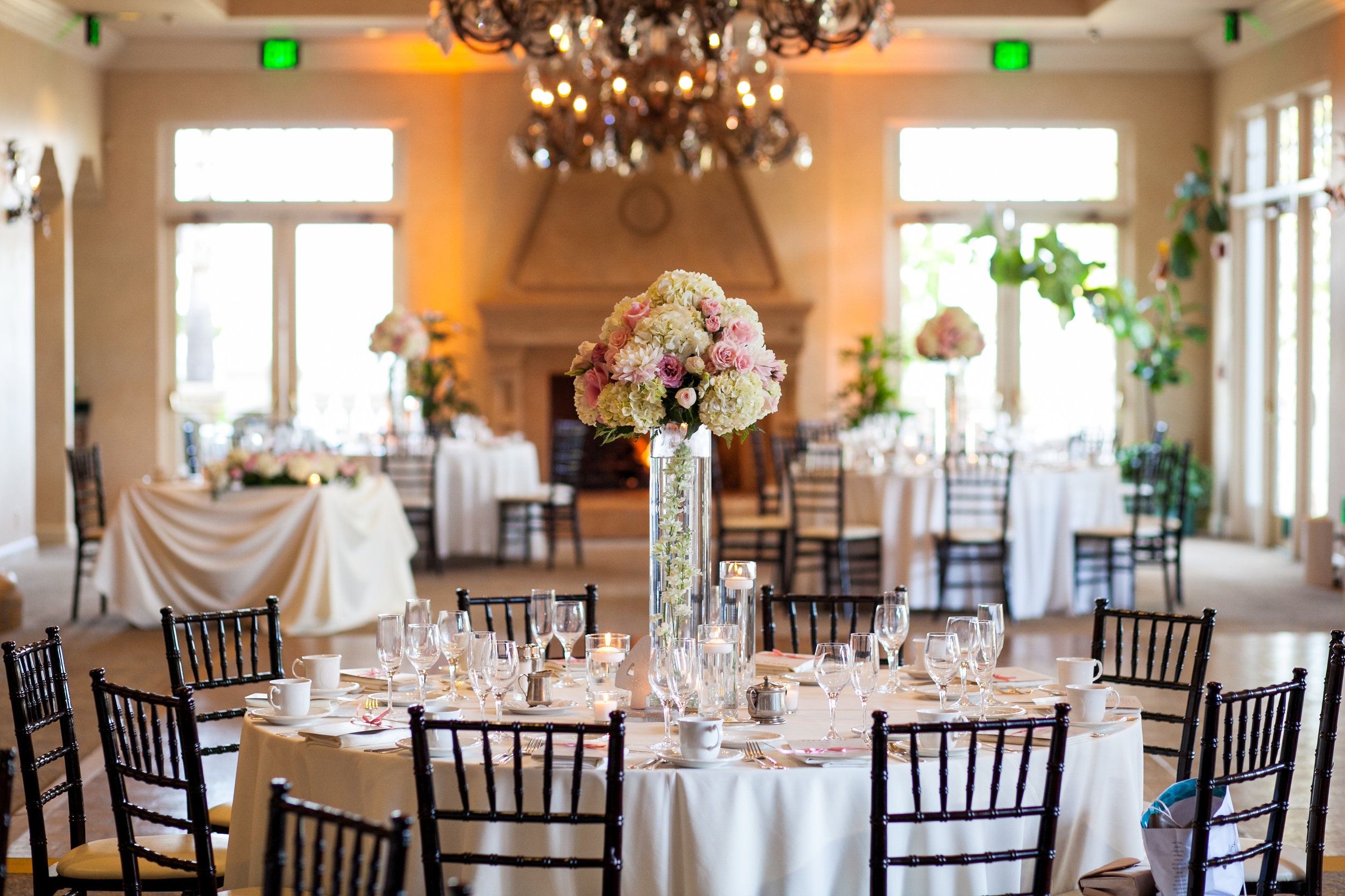
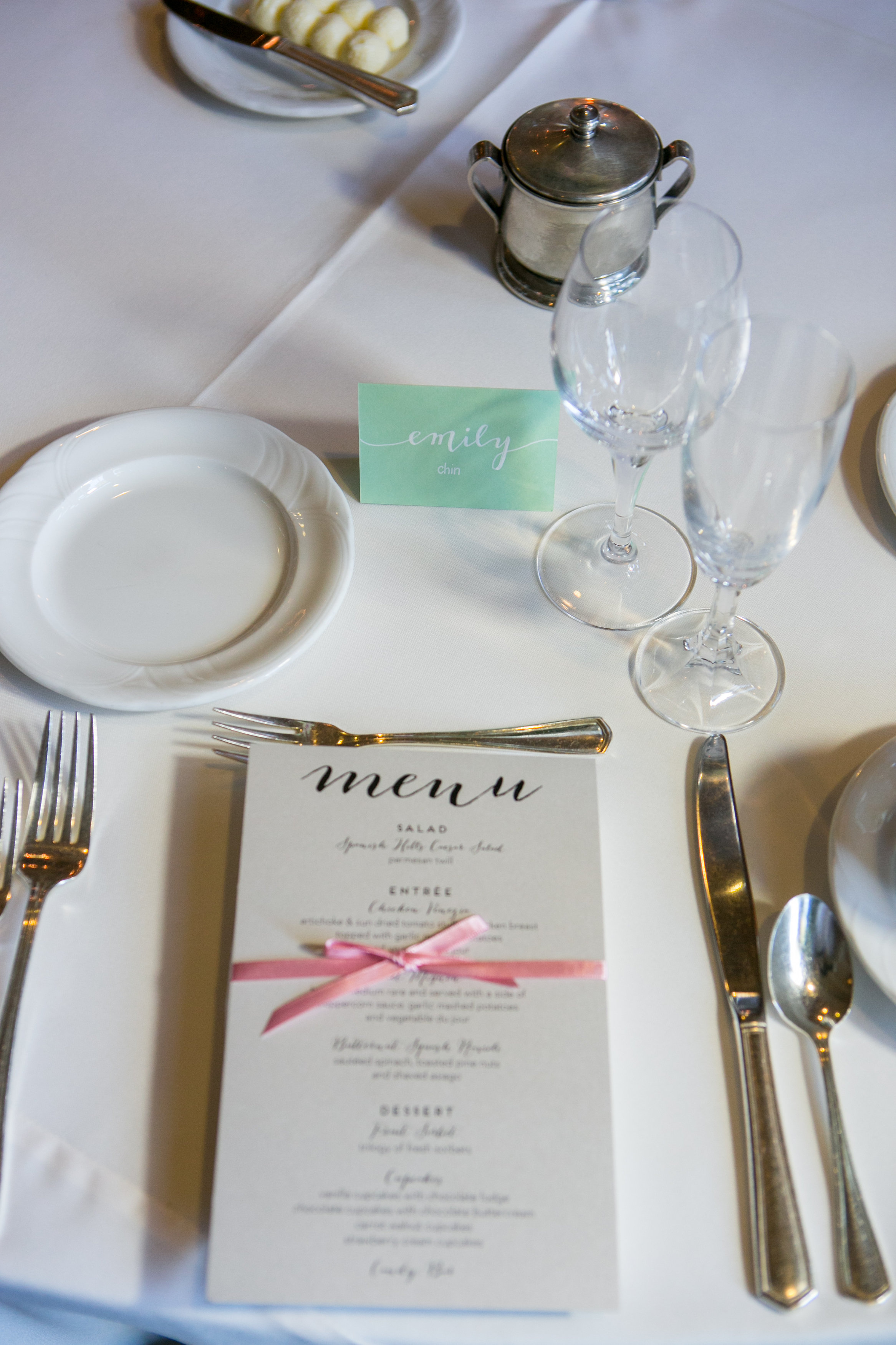
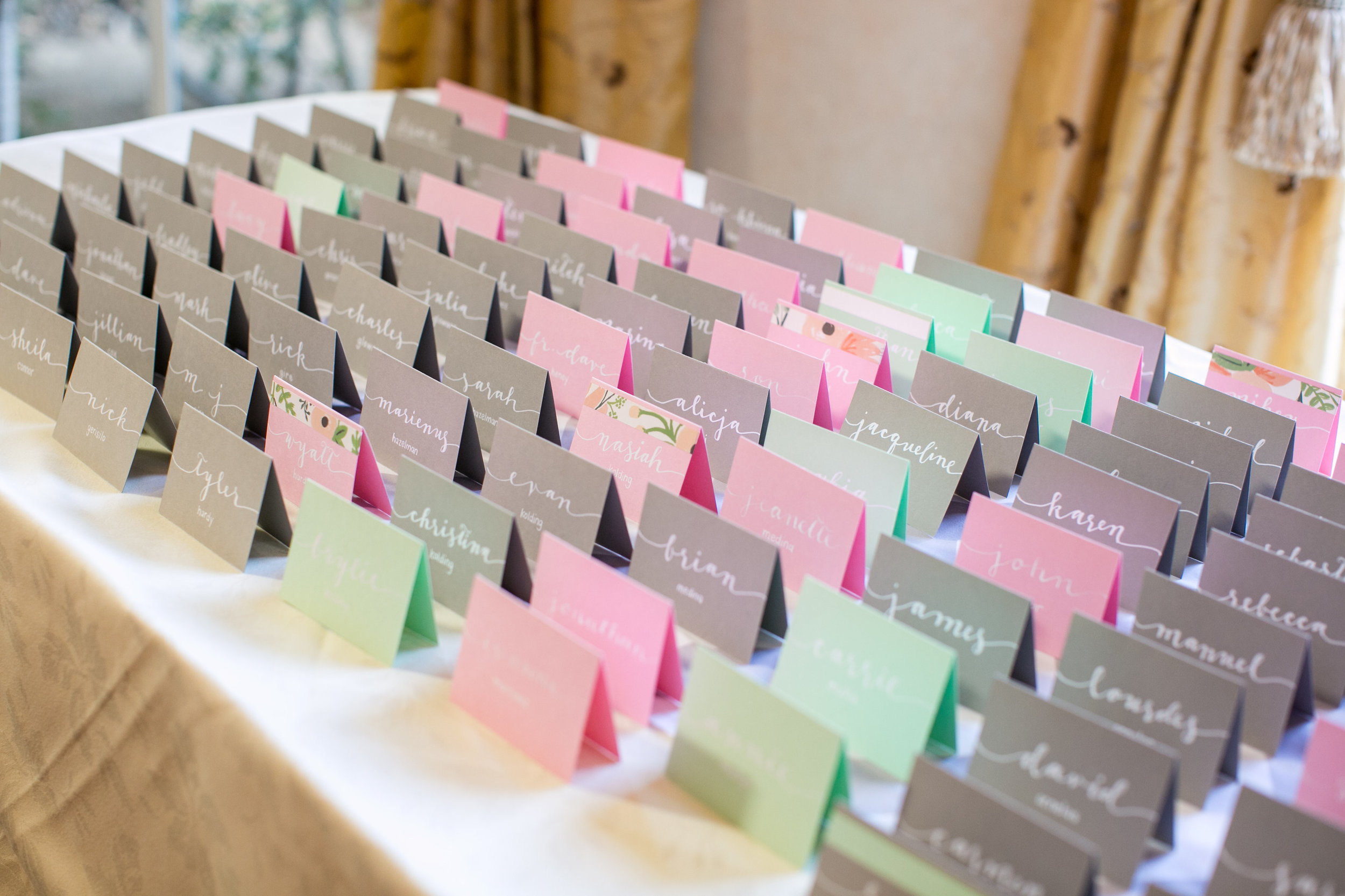
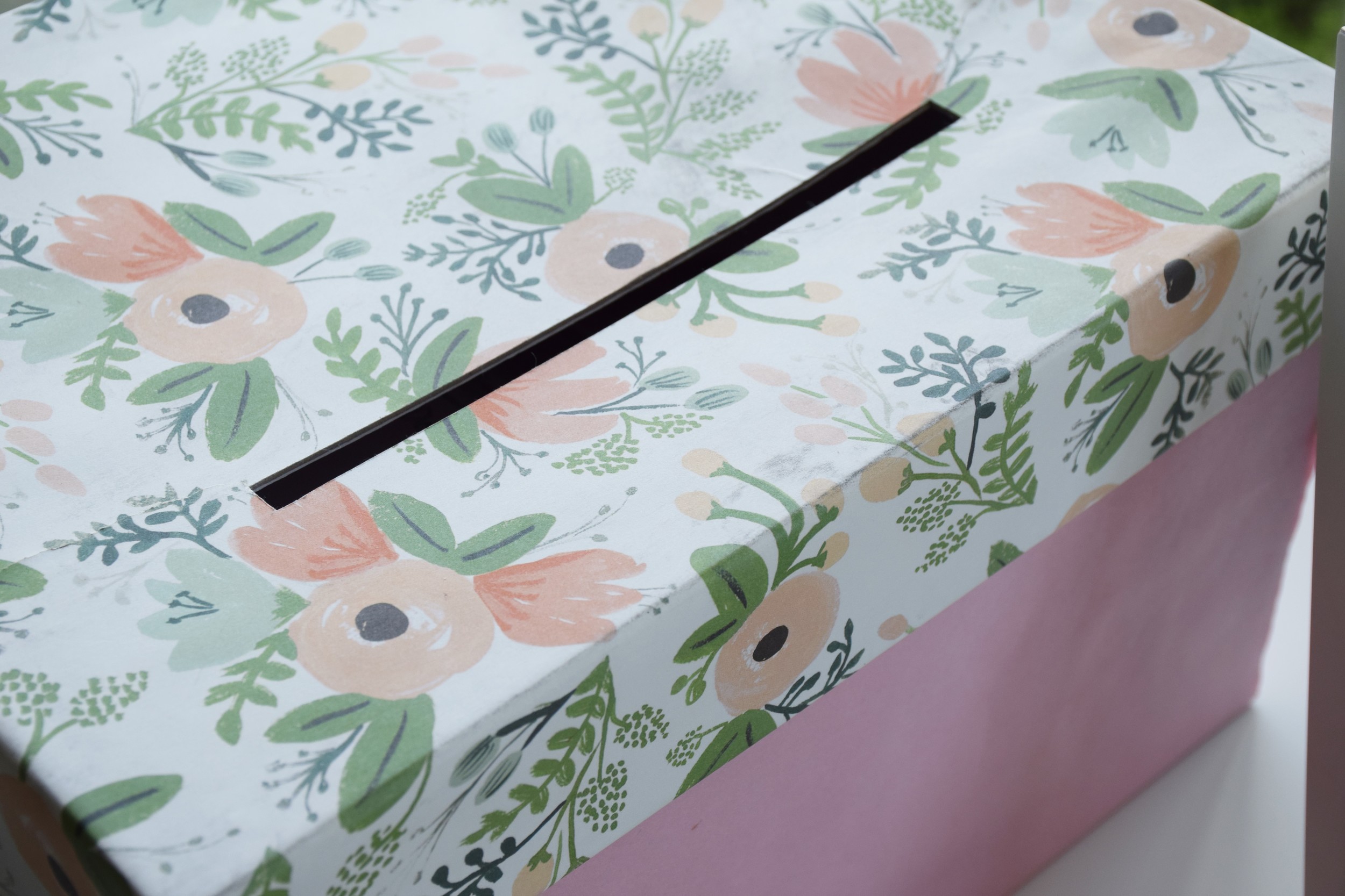
All the pretty little details! Menu, card box, escort cards and calligraphy by moi! We used this beautiful print from RIFLE PAPER Co. as an accent across her invites and decor.
Who can resist cupcakes and a candy bar?! That's me helping set up! I also made all of the signs and labels for the table along with the favor bags.
Creative, and fun, guestbook! They had polaroid cameras out for guests to take a picture and leave a note in the custom book that I made for them!
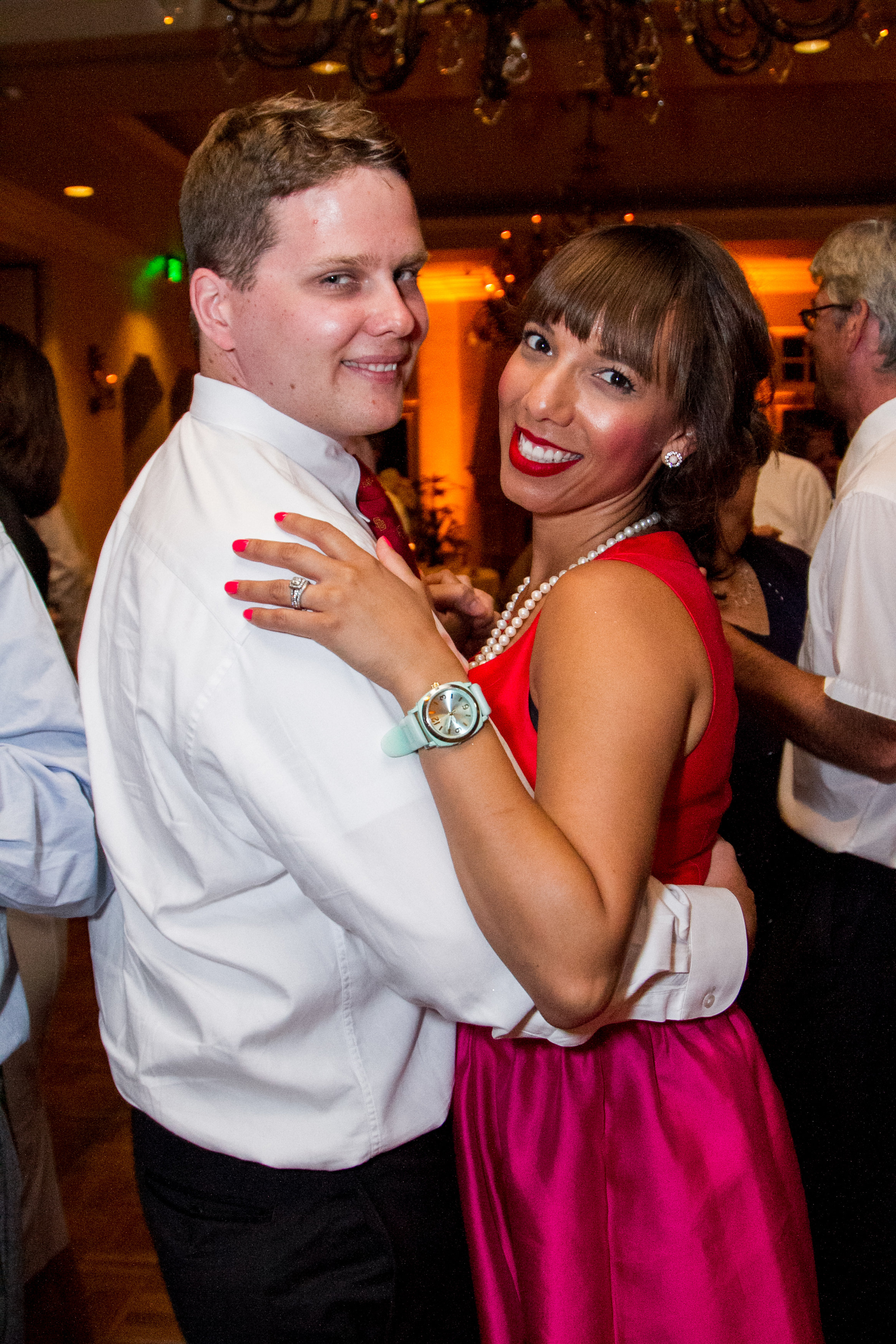
Dancing the night away!
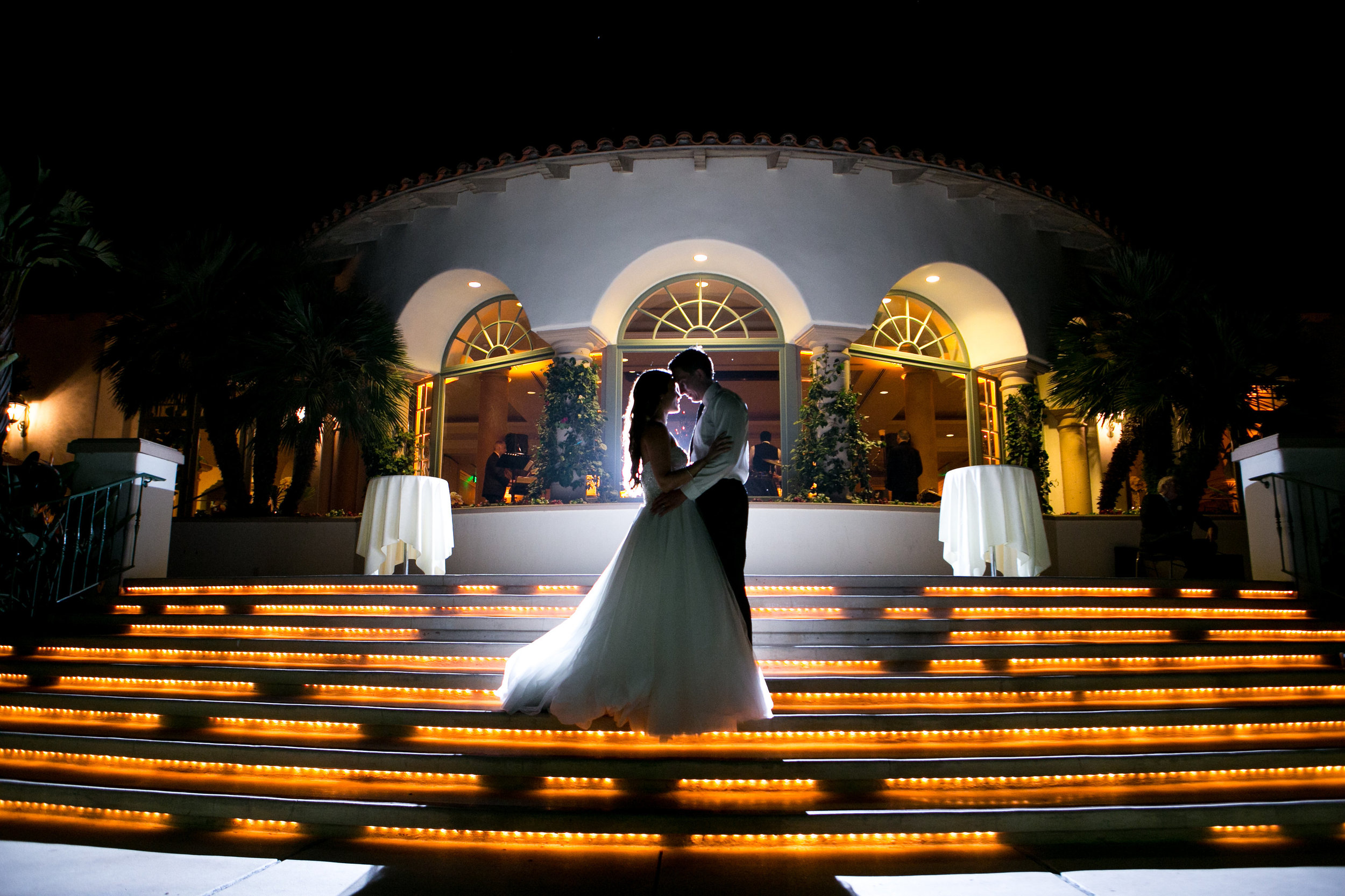
And they lived happily ever after <3
Mirror, Mirror, in the Reception Hall!
Signs can be so helpful and so much FUN for a wedding! I've done all sorts of signs written on all sorts of mediums (hello, 5-foot by 4-foot stained wooden board!), and today I'm sharing with you a set of signs done on mirrors sourced by the bride herself!
I've been doing these more and more, and seating charts are my jam! At first they seemed a little intimidating (read: giant piece of wood mentioned earlier), but as I've been on my fourth year of the Seattle wedding industry, I've learned a few tricks that has made this a breeze! First of all, despite rumors, I am not a robot with insanely perfect handwriting -- okay, I'm a human with insanely perfect handwriting MOST of the time. I can write pretty straight, but to err is human, so I like to use washi tape and baker's twine to give me a reference point as I write out 100-200 names!
Finished!
Finished product! It's always hard taking pictures of mirrors -- I tried to get as little as possible in the shot, but you can still see a light fixture and some lovely architecture prints!
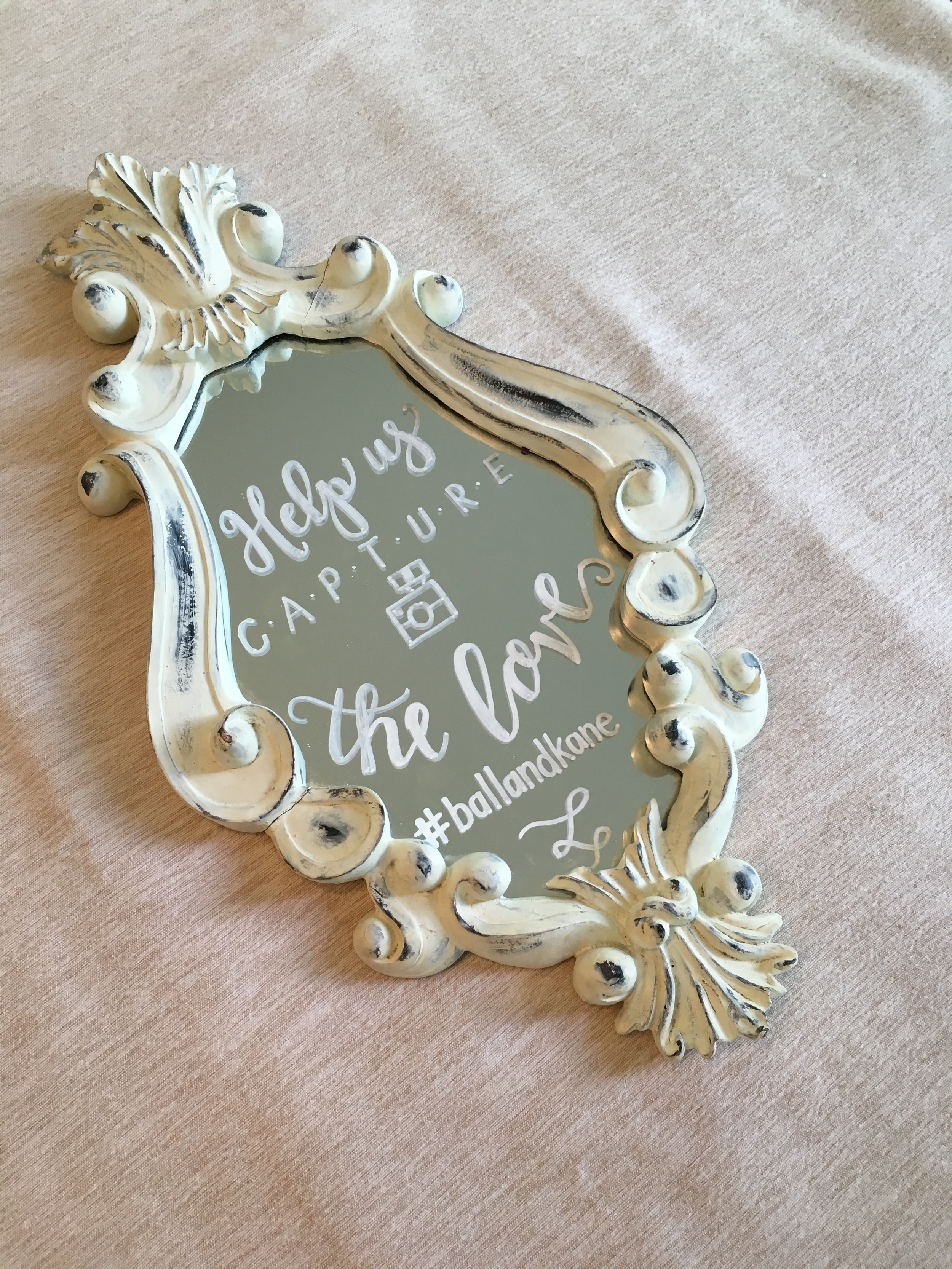
In addition to the seating chart, the bride also had three smaller signs that she placed on the bar and at her favor table! Other than being useful, signs can be SO much fun and help your guests out by letting them know your #hashtag or that it's okay to dance because alcohol. ;o)
Happy wedding season, everyone! Look for more signage on my Instagram feed!
xoxo,
Rosie
Current Obsession: White on Black
I can be slightly obsessive when it comes to paper and ink. Just a little bit. Almost as obsessive as I am with things that sparkle (I’ll tell you in a later post why my husband, Mr. Architect, calls me “Barracuda”.).
But right now, what is really catching my eye is white ink on black or other dark colored paper. I’m not talking about digitally – I’m talking about in the flesh!
I can be slightly obsessive when it comes to paper and ink. Just a little bit. Almost as obsessive as I am with things that sparkle (I’ll tell you in a later post why my husband, Mr. Architect, calls me “Barracuda”.).
But right now, what is really catching my eye is white ink on black or other dark colored paper. I’m not talking about digitally – I’m talking about in the flesh! This year for SBP’s (my nickname for this little business) Christmas card line, I went for a hand lettered theme and wrote Christmas sayings on all of my cards in white ink. They’re seriously cute:
It wasn’t until I was looking at my practice paper, which is black, and all the white hand lettered words that I wrote over and over again until they looked just right, did I realize that it’s more than white ink that I’m obsessed with – it’s white over black.
So I made another Christmas card.
This was a last-minute-completely-unplanned-and-not-at-all-discussed-with-my-business-manager (I’ll make intros on a future blog post) Christmas card. It’s one of those designs that hit me over the head at 2:30 in the morning! It’s so much fun:
I may have cheated a little bit and used one of the sayings on my planned Christmas card, but I reeeeeally liked the image it created! Nothing is brighter on black paper than white ink.
White ink is something that you can’t get in the digital world (at least not easily), so you turn to hand lettering/calligraphy, letterpress, embossing, and chalk board art. You can design it digitally, but when your printer prints it out, it’s just *not* printing the white part. To get true white art, you gotta make it yourself.
I was chatting with Mr. Architect about this concept, and he told me “It’s like writing with no color.” I quickly responded, like the smarty-pants I can be, “ACTUALLY, white is the accumulation of ALL colors. Black is the absence of color.” And of course, Mr. Architect is always armed with quick, witty responses: “Yes, but only when the spectrum of light is concerned.”
Oh. Yeah.
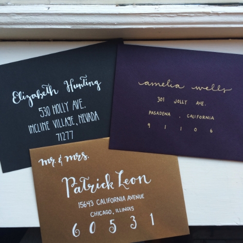
White ink is truly beautiful. It beckons you to think outside of the traditional correspondence pieces of white envelopes and black ink, and tempts you with the modern elegance of a dark, used-to-be-rarely used color (in the stationery world), making you become a believer of writing with nothing. It takes your breath away – at least mine. In this trio of envelopes, the white definitely catches your eye:
Looking forward to making more white-on-black hand lettered pieces!
And probably white-on-radiant-orchid, Pantone’s 2014 Color of the Year! I’ll save that for a future blog post. (Okay, I gotta stop with this future blog post business… I am now up to three promised future blog topics!)
May your Christmas be merry and bright white, everyone!
xoxo,
Rosie


