Wednesday Weddings: Moonrise Kingdom Inspiration
I'm starting my New Year's resolutions a teensy bit late. I mean, I'm going to start keeping them as of... now! I vowed to blog six -- er, five days a week, and now I"m going to keep it!
Wednesdays we wear pink. Kidding! Love that movie, though! Wednesdays we talk Weddings. Today I have for you paper elements from a Moonrise Kingdom-inspired wedding! I keep wanting to say Moonshine... wow, where is my head?
Anyway, last week I had the privilege of being the featured stationery vendor for an open house at this awesome new wedding venue in the Pioneer Square neighborhood of downtown Seattle, Axis Pioneer Square:
Image: Phinney Wood
I was approached to do this open house by my lovely and wonderful friend Rachel of butter & bloom to be a part of this super fun Moonrisey (yup, just made up a word!) evening, just after the Seattle Wedding Show weekend ended. The event coordinator she was working with, Holly of Perfectly Posh Events, was looking for a stationer, and bam! Rach got me in. Thanks, Rach!
Here was the inspiration for the mock-wedding ceremony and reception at the open house:


SO ADORABLE, right?! The sweetness of these photos cannot be contained! So, away I went to work and started creating. It's going to get real cute up in here!
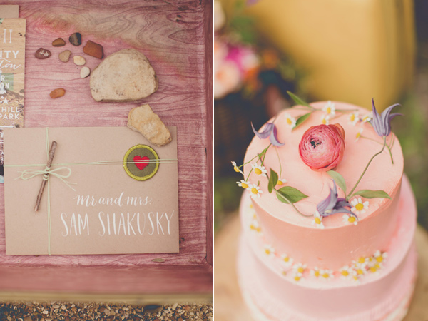
First off was the lettering. Hand lettering and calligraphy has a special place in my OCD heart. :o) It's just so perfect and sometimes perfectly imperfect at the same time! I chose a bright purple and paper bag for the place cards, with white and gold lettering:
This hand lettering style I named "Kennedy". She's pretty and modern, which is exactly the opposite cursive my third grade teacher, Mrs. Kennedy, taught our class. :)
Next I started creating the favor boxes. I used paper bag boxes and used some really gorgeous fine paper and bright circle stickers with the same lettering.
Yes, the pretend bride and groom were named Sam and Suzy. By chance. Just kidding. It was planned!
Isn't this fine paper gorgeous? The yellow and orange really complemented the floral pieces by butter & bloom, which you'll see down below!
Here's a funny photo... I didn't get some good photos of the menus (or the signs I crafted to thank and name the vendors at the open house, or the ceremony programs)... I'll have to post an update tomorrow! But here's a glimpse of the menus and programs for now:
Again, I used paper bag for the menus and a bright purple ribbon to accent and bring in 2014's Pantone Color of the Year, Radiant Orchid! Gorgeous.
Here's how all of the reception table elements came together:
Here's how the whole table looked, including the vibrant centerpieces Rachel put together!
Everything turned out beautifully!
And the grand finale was this teensy weensy cute little cake topper that I created out of gold shimmery paper. It was a script "S". The lighting in the venue made it hard to tell it was sparkly, but you can imagine that with your eyes. :o)
And so that was that! Tomorrow I'll have to post some more photos, but tomorrow will be Thursday How-To. Might have to make an addendum to this guy and add some more photos after the fact. You'll have to check back later to find some more awesome Moonrise Kingdom-inspired wedding paper creations!
Thanks for reading! Hopefully this inspired you to add fun color to your wedding a la Moonrise!
xoxo
Rosie
Current Obsession: White on Black
I can be slightly obsessive when it comes to paper and ink. Just a little bit. Almost as obsessive as I am with things that sparkle (I’ll tell you in a later post why my husband, Mr. Architect, calls me “Barracuda”.).
But right now, what is really catching my eye is white ink on black or other dark colored paper. I’m not talking about digitally – I’m talking about in the flesh!
I can be slightly obsessive when it comes to paper and ink. Just a little bit. Almost as obsessive as I am with things that sparkle (I’ll tell you in a later post why my husband, Mr. Architect, calls me “Barracuda”.).
But right now, what is really catching my eye is white ink on black or other dark colored paper. I’m not talking about digitally – I’m talking about in the flesh! This year for SBP’s (my nickname for this little business) Christmas card line, I went for a hand lettered theme and wrote Christmas sayings on all of my cards in white ink. They’re seriously cute:
It wasn’t until I was looking at my practice paper, which is black, and all the white hand lettered words that I wrote over and over again until they looked just right, did I realize that it’s more than white ink that I’m obsessed with – it’s white over black.
So I made another Christmas card.
This was a last-minute-completely-unplanned-and-not-at-all-discussed-with-my-business-manager (I’ll make intros on a future blog post) Christmas card. It’s one of those designs that hit me over the head at 2:30 in the morning! It’s so much fun:
I may have cheated a little bit and used one of the sayings on my planned Christmas card, but I reeeeeally liked the image it created! Nothing is brighter on black paper than white ink.
White ink is something that you can’t get in the digital world (at least not easily), so you turn to hand lettering/calligraphy, letterpress, embossing, and chalk board art. You can design it digitally, but when your printer prints it out, it’s just *not* printing the white part. To get true white art, you gotta make it yourself.
I was chatting with Mr. Architect about this concept, and he told me “It’s like writing with no color.” I quickly responded, like the smarty-pants I can be, “ACTUALLY, white is the accumulation of ALL colors. Black is the absence of color.” And of course, Mr. Architect is always armed with quick, witty responses: “Yes, but only when the spectrum of light is concerned.”
Oh. Yeah.
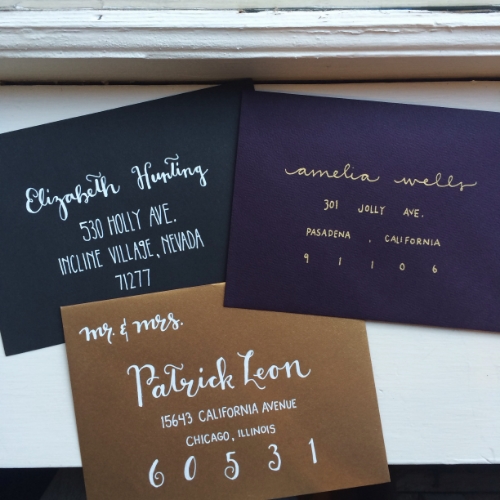
White ink is truly beautiful. It beckons you to think outside of the traditional correspondence pieces of white envelopes and black ink, and tempts you with the modern elegance of a dark, used-to-be-rarely used color (in the stationery world), making you become a believer of writing with nothing. It takes your breath away – at least mine. In this trio of envelopes, the white definitely catches your eye:
Looking forward to making more white-on-black hand lettered pieces!
And probably white-on-radiant-orchid, Pantone’s 2014 Color of the Year! I’ll save that for a future blog post. (Okay, I gotta stop with this future blog post business… I am now up to three promised future blog topics!)
May your Christmas be merry and bright white, everyone!
xoxo,
Rosie


