Art Deco Wedding Paperie
It's been about a month since the Northlake Wedding & Events Show, and I'm excited to announce that I just received the fabulous pictures from my venue! The photographers were amazing and are from Seattle Flashing Lights Photography.
The theme for our venue, Hotel Deca, was "Rendez-vous a Paris". Think Roaring Twenties meets Moulin Rouge meets Gatsby and Art Deco, all rolled into one big wedding! Tons of gold and black with pops of red for added drama.
I had the pleasure of doing all of the paper goods for my venue -- menus, place cards, escort cards (yup, we did both!), "programs" (ceremony programs that were actually programs with our venue's vendor details), buffet dish labels, invite suite... I think that was it!
Check out that gold flatware -- gorgeous, right?! It makes me want to have a set of my own! Anyway, everything looked gorgeous against the black tablecloth. The place cards were held up by teensy tiny gold succulents. So cuuuuuuute! And of course, I did gold calligraphy for the place cards, AND matching gold embossed stamp with a very art deco-y design.
Side note: How GORGEOUS is this cake done by Stone Layne Baked Specialties? This girl is majorly talented! Her level of detail was pretty darn awesome. One more:
So lovely! Okay, back to paper and ink.
I used an enclosure (Love love LOVE enclosures. They're so dramatic without being all teenager-y) with a gold glittery band and a fine paper square fastener. It sort of reminds me of an obi on a kimono... very beautiful!
And I used my favorite layout -- font heavy, pretty drastically different fonts that came together beautifully!
Oh hey! There's my table!! I had a lot on it... next time I think I need to have some additional shelving behind me to display all of the paper goodies!
Well that was a fun day! I look forward to maybe doing this again next year! But just around the corner, I will be at another wedding show/tour! This time it will be Weddings in Woodinville and I am so STOKED! January 25th, 2015, here I come!
Here is the list of participating vendors from my venue:
Planner: Maris Events
Caterer: EatDrink Catering
Photographer & Photo Booth: Seattle Flashing Lights
DJ: Magnolia Rhapsody
Rentals: Abbey Party Rentals
Florist: Althauser Design
Stationery: Songbird Paperie
Dessert: Stone Layne Baked Specialities
Officiant: The Wedding Gentleman
Makeup: Younique Products
Live Event Painting: Lynette Marquis, Artist
xoxo,
Rosie
Current Obsession: White on Black
I can be slightly obsessive when it comes to paper and ink. Just a little bit. Almost as obsessive as I am with things that sparkle (I’ll tell you in a later post why my husband, Mr. Architect, calls me “Barracuda”.).
But right now, what is really catching my eye is white ink on black or other dark colored paper. I’m not talking about digitally – I’m talking about in the flesh!
I can be slightly obsessive when it comes to paper and ink. Just a little bit. Almost as obsessive as I am with things that sparkle (I’ll tell you in a later post why my husband, Mr. Architect, calls me “Barracuda”.).
But right now, what is really catching my eye is white ink on black or other dark colored paper. I’m not talking about digitally – I’m talking about in the flesh! This year for SBP’s (my nickname for this little business) Christmas card line, I went for a hand lettered theme and wrote Christmas sayings on all of my cards in white ink. They’re seriously cute:
It wasn’t until I was looking at my practice paper, which is black, and all the white hand lettered words that I wrote over and over again until they looked just right, did I realize that it’s more than white ink that I’m obsessed with – it’s white over black.
So I made another Christmas card.
This was a last-minute-completely-unplanned-and-not-at-all-discussed-with-my-business-manager (I’ll make intros on a future blog post) Christmas card. It’s one of those designs that hit me over the head at 2:30 in the morning! It’s so much fun:
I may have cheated a little bit and used one of the sayings on my planned Christmas card, but I reeeeeally liked the image it created! Nothing is brighter on black paper than white ink.
White ink is something that you can’t get in the digital world (at least not easily), so you turn to hand lettering/calligraphy, letterpress, embossing, and chalk board art. You can design it digitally, but when your printer prints it out, it’s just *not* printing the white part. To get true white art, you gotta make it yourself.
I was chatting with Mr. Architect about this concept, and he told me “It’s like writing with no color.” I quickly responded, like the smarty-pants I can be, “ACTUALLY, white is the accumulation of ALL colors. Black is the absence of color.” And of course, Mr. Architect is always armed with quick, witty responses: “Yes, but only when the spectrum of light is concerned.”
Oh. Yeah.
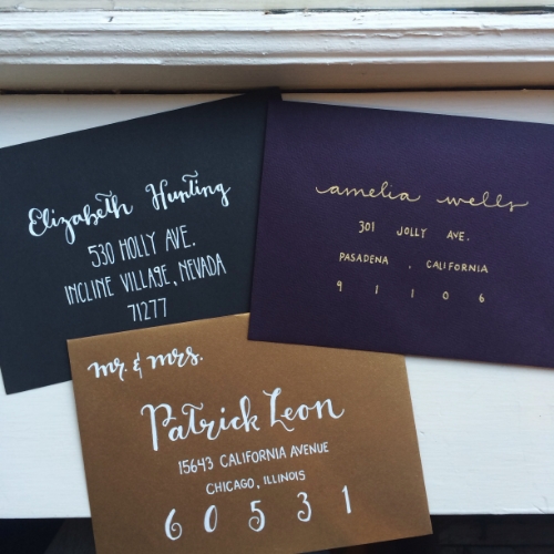
White ink is truly beautiful. It beckons you to think outside of the traditional correspondence pieces of white envelopes and black ink, and tempts you with the modern elegance of a dark, used-to-be-rarely used color (in the stationery world), making you become a believer of writing with nothing. It takes your breath away – at least mine. In this trio of envelopes, the white definitely catches your eye:
Looking forward to making more white-on-black hand lettered pieces!
And probably white-on-radiant-orchid, Pantone’s 2014 Color of the Year! I’ll save that for a future blog post. (Okay, I gotta stop with this future blog post business… I am now up to three promised future blog topics!)
May your Christmas be merry and bright white, everyone!
xoxo,
Rosie


